





Hue
The colour family: red, yellow, blue and their neighbours. The wheel arranges these relationships. Changing hue is different from making the same hue lighter or darker.

Wahnapitae, ON P0M 3C0
Phone: 705-694-0065
Fax: 705-694-1594
Toll Free: 1-877-224-2323
Email: info@ibeadcanada.com
Mon-Sat: 10am - 6pm
Sun: 11am-5pm
Mon-Sat: 10am - 6pm
Sun: 11am-5pm

Free Shipping on Most Orders Over $150* – Learn More >
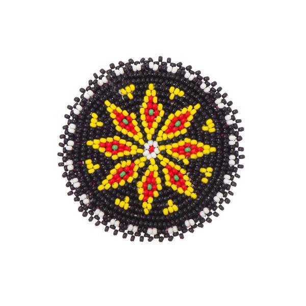 Beaded Rosettes
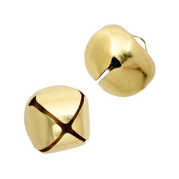 Bells
 Cabochons
 Dolls & Acc.
 Dream Catcher Rings
 Drum Making
 Flat Back Stones
 Jingle Cones
 Mirrors
 Pipe Stems
 Rhinestone Banding
 Sequins
 Sew On Stones
 Beading Foundation
 Crepe Soles
 Fabric
 Fringe
 Ribbon
 Trim
 Bails
 Bolo Tie Acc.
 Bookmarks
 Brooch & Bar Pins
 Buckles
 Buttons
 Caps & Cones
 Chain Extenders
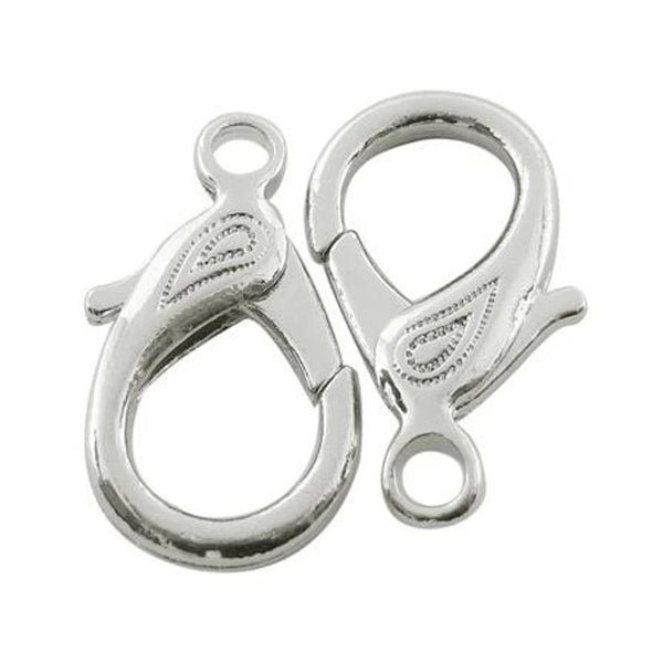 Clasps
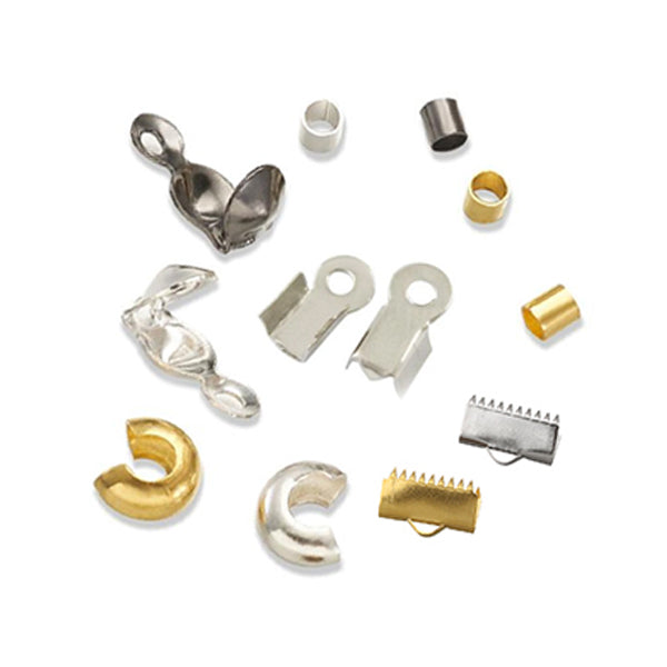 Crimps & Ends
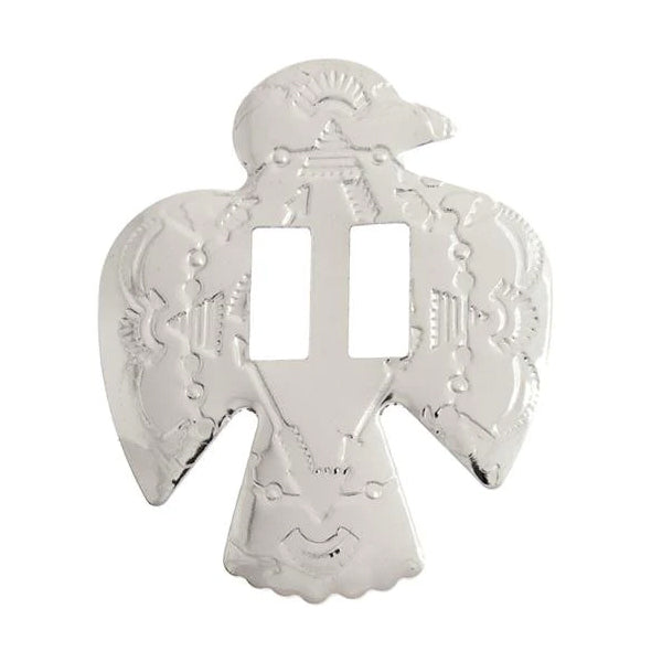 Conchos
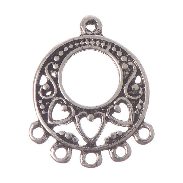 Connectors
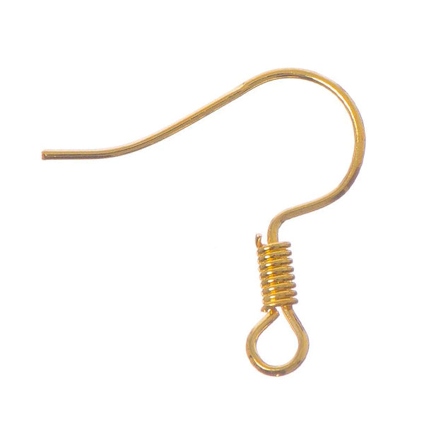 Earring Components
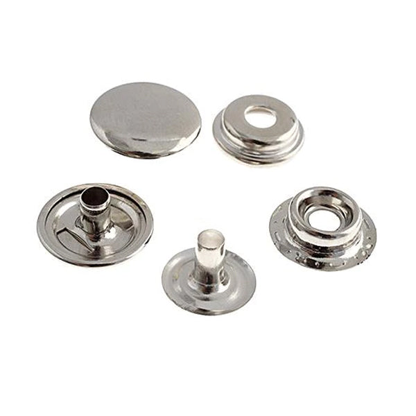 Eyelets & Snaps
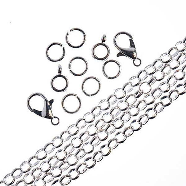 Findings Sets
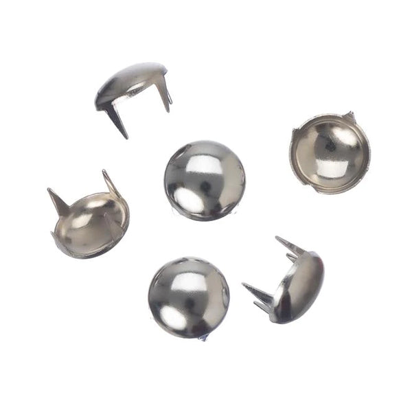 Garment Studs
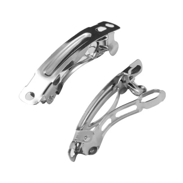 Hair Accessories
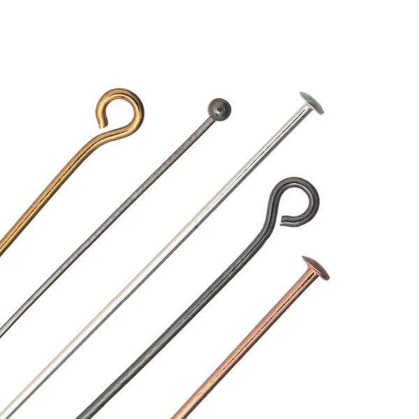 Head & Eye Pins
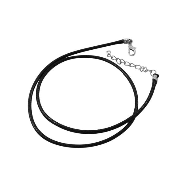 Jewelry Parts
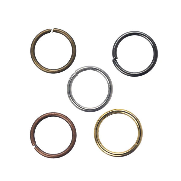 Jump & Split Rings
 Key Chain Parts
 Mobile Phone Acc.
 Safety Pins
 Wire Guards
 Leather & Rawhide
 Cord
 Chain
 Leather & Suede Lace
 Sinew
 Thread
 Jewelry Wire
 Memory Wire
 Shaping Wire
 Bead & Craft Kits
 Books
 Patterns
 Displays
 Gift Bags
 Gift Boxes
 Jewelry Cards
 Organizers
 Tags, Labels & Stickers
 Zip Lock Bags
 Chakra
 Healing Stones
 Incense & Holders
 Mala Beads & Acc.
 Oils & Burners
 Rocks & Minerals
 Smudging
i-Bead Inc. learning library · History & making
Choose a starting colour, explore a harmony and watch your palette become a bead pattern. Then discover the ideas that help colour combinations feel intentional.
Try the colour studio →A little colour. A world of possibilities.
Click a colour on the wheel or use the controls. Your palette and bead pattern update together.
Traditional RYB design wheel · 12 hue families
Or start with a mood
Opposites with energy. Blue and orange sit opposite each other on this traditional wheel.
Choose your main colour with the circle or a HEX code, such as #FED500. The recommended colours and beads update together.
Try a dominant blue with small orange accents.
A sample arrangement—not a bead-size or fit guide.
Screen colours are planning examples. Actual beads vary with material, finish, transparency and lighting. Compare the physical beads before choosing your final combination.
The colour family: red, yellow, blue and their neighbours. The wheel arranges these relationships. Changing hue is different from making the same hue lighter or darker.
How light or dark a colour appears. A pale blue and navy share a hue family but differ in value. Value contrast helps a pattern remain visible, even when its colours are closely related.
How vivid or subdued a colour looks. Bright colours attract attention; quieter colours can give them space. Intensity is also called saturation or chroma in many design discussions, though technical definitions vary.
A tint is a hue lightened with white; a shade is darkened with black. A tone often means a hue mixed with grey. In beadwork you select materials with these appearances rather than literally mixing paint. The studio’s sliders illustrate the effect, but actual glass and gemstone colours will vary.
The familiar red–yellow–blue wheel is a traditional art and design model. Its secondaries are orange, green and violet, with intermediate hues between them. Screens use light and printing uses other colour systems, so this wheel is a relationship guide rather than a precise simulator of pigment mixing.
Start with a relationship, then adjust the proportions, value and finish. These arrangements are useful starting points—not rules that guarantee a pleasing result. Some less common names vary between authors; their meaning in this guide is explained below.
Choose one colour, then vary its lightness, depth and finish. A pale blue, a clear mid-blue and a deep navy can feel related without looking identical. In beadwork, changing size, surface texture or transparency adds interest to a single-colour design. A monochromatic palette still needs contrast if you want a pattern to remain easy to see.
Three neighbouring hues make a gentle transition. This version uses the chosen colour and its immediate neighbours; broader analogous palettes can include more. Start with one main colour, then bring in the neighbours as supporting notes. This is useful when two beads are close in colour but are not an exact match: make the variation deliberate instead of trying to hide it.
Two colours opposite one another on this traditional wheel: red and green, blue and orange, or yellow and violet. Their contrast can make each feel more vivid. Try a small amount of the second colour before committing to an even split. Either the warm or cool colour can dominate; there is no universal rule that one must always be used more sparingly.
A small family of neighbouring hues is given a contrasting accent from the opposite side of the wheel. Let the related colours establish the overall mood, then use the complement to catch the eye. A focal bead, a few spacers or one repeated stitch can be enough. This is a useful arrangement rather than a guarantee that every combination will feel balanced.
Choose two adjacent colours and the complements opposite them. The result combines closeness within each pair with contrast between the pairs. Keep one pair visually stronger, or soften some of the colours with lighter values or quieter finishes. Four equally bright colours can be lively, but they can also compete with a detailed beading pattern.
Pair the chosen hue with a colour one segment away from its exact complement. It keeps much of the contrasting character while avoiding the most direct opposition. The tool uses the neighbour before the complement; the neighbour on the other side is another valid option. Test both directions with your actual beads and choose the one that suits the project.
Start with a main colour and use the two hues immediately beside its complement. The main colour remains the anchor while the other two introduce variety. It can be easier to manage than several unrelated bright colours. Try a dominant main colour with two smaller accents, then switch to an even balance to see how much busier the same palette becomes.
Three points spaced evenly around the wheel form a triangle. Red, yellow and blue make one triad; orange, green and violet make another. These palettes offer clear variety. For a quieter result, make one colour dominant or choose softer versions of the hues. The geometry describes their relationship; your choices of value, finish, bead size and proportion determine the final effect.
In this guide, this name means three colours placed two wheel steps apart across part of the circle. It is not an evenly spaced triad, and the name is not used consistently by every colour reference. Think of it as a practical variation to explore: it gives more separation than immediate neighbours without distributing the colours all the way around the wheel.
This guide uses the name for a complementary pair with a third hue halfway between them along one side of the wheel. That middle colour can bridge the contrast or act as a separate accent. There is another midpoint on the other half of the circle, so this is one possible arrangement. Names for these less common combinations vary between authors.
Four hues form a rectangle on the wheel, giving two complementary pairs. This offers plenty of variety for patterned beadwork, but it helps to decide which colour tells the main story. Use the remaining colours as supporting tones or small accents. You can also calm the scheme by lowering the intensity of some hues, rather than giving all four equal visual weight.
Four hues are separated by equal steps around the wheel. The result can look playful and varied, especially in small repeated patterns. Equal spacing does not require equal quantities. A dominant colour, a neutral background or differences in lightness can make the design easier to read while keeping all four hue families present.
Use a broad range of hues, then create order through a repeating sequence, similar bead sizes or a shared level of lightness. A rainbow can be a deliberate system rather than a random assortment. If the colours start to compete, try matching their intensity or adding quiet spaces. A limited selection of many colours is also a multicolour design; twelve is not a requirement.
Creams, tans, browns and other subdued colours can form a complete palette or support brighter beads. “Neutral” does not always mean colourless: a brown may lean red, yellow or grey. Check those undertones beside your chosen accent. The studio shows a fixed earthy example for this option, so it does not depend on the starting hue.
An achromatic scheme uses no coloured hue. Its interest comes from light and dark, surface finish, scale and pattern. Black matte beads and glossy black beads can look different even though they share a colour name. White, charcoal and a middle grey offer a useful way to study contrast before adding colour. The studio uses a fixed greyscale example.
A dominant colour creates a clear starting point. Try roughly 60% main colour, 30% supporting colour and 10% accent in a three-colour design, then adjust by eye. This is a design exercise, not a required formula.
Matte, glossy, transparent, lined and metallic beads reflect light differently. Two beads with the same colour name may feel quite different together. A change of finish can add interest without adding another hue.
A bright accent, a larger bead or a strong light–dark contrast can draw attention. Decide where you want the eye to go, then reduce competing accents elsewhere if the piece feels busy.
Lay out a short repeat or stitch a test swatch. Look at it in daylight and under the lighting where it will be worn. Check the colours against the wearer’s clothing and against each other, not only in separate bags.
Reds, oranges and yellows are commonly described as warm; blues and blue-greens as cool. A colour can also appear warmer or cooler beside another colour. These are useful descriptions, not fixed emotional instructions.
Personal experience, culture, context and finish influence how a palette feels. Red may suggest celebration, warmth, drama or something else entirely. Choose the story that fits your wearer and project instead of assuming that one colour means the same thing to everyone.
Surrounding colours affect perception. The two circles below have exactly the same fill colour, but their backgrounds can make them appear different. In a real piece, reflected light, transparency and surface finish add further effects.
Move a sample bead between a light surface, a dark surface and the intended fabric before finalising the palette. Photographs and screens may shift the appearance, so use actual materials for the final decision.
White, cream, grey, black and earthy colours can separate stronger hues or become the main palette. Check undertones: a yellow-cream bead and a blue-white bead may not behave like interchangeable “white” beads.
Gold-coloured, silver-coloured and copper-coloured components introduce their own reflections and temperature. Try the clasp and spacers beside the beads early. Small metal elements can link a palette together or introduce more contrast than expected.
Colour theory has many contributors, rather than one inventor. Isaac Newton’s experiments with light helped establish a spectral account of colour, and his Opticks of 1704 included a circular arrangement. Later writers and artists explored both physical colour and the way people perceive it.
Goethe approached colour through observation and perception; Michel-Eugène Chevreul examined the effects of neighbouring colours. Their interests were not identical, and their work should not be collapsed into one universal colour system.
At the Bauhaus, teachers including Johannes Itten, Paul Klee and Wassily Kandinsky developed influential approaches to colour and form. Josef Albers’s later teaching placed particular emphasis on colour relationships and perception. The Getty’s Bauhaus resources show how varied these approaches were.
For a beadmaker, that history offers a useful lesson: colour is both a material property and an experience shaped by its surroundings. A wheel can help you begin, but looking, comparing and making samples are how a palette becomes your own.
Sign up today to stay in the loop about the hottest deals, coolest new products, and exclusive sales.
Thanks for subscribing!
This email has been registered!
Last updated: October 19, 2026
Summary of i-Bead Inc.'s Terms of Service:
Product Descriptions: i-Bead Inc. strives for accurate product information, but errors may occur. Product availability and specifications, like size, are subject to change.
Product Images: Images are for representation purposes; actual products may vary in appearance due to display settings or manufacturing differences.
Copyright & Intellectual Property: All content on the Website is owned by i-Bead Inc. or its licensors. Users are granted a limited, non-commercial license to view and print content for personal use but cannot reproduce or distribute it without permission.
Trademarks: The i-Bead name and logo are trademarks of i-Bead Inc. Unauthorized use of trademarks is prohibited.
Use of the Website: Users must comply with laws and the Terms. Account creation may be required for certain services. Users are responsible for account security and cannot engage in harmful behavior or unauthorized access.
Pricing & Availability: Prices are listed in Canadian Dollars (CAD) and are subject to change. Additional charges for taxes, shipping, and duties may apply. Out-of-stock products may be removed or delayed.
Limitation of Liability: i-Bead Inc. is not liable for any indirect damages, and the website is provided "as is" without warranties.
Privacy & Data Protection: The use of personal data is governed by the company’s Privacy Policy, which users should review.
Indemnification: Users agree to defend and hold i-Bead Inc. harmless from any legal issues arising from their use of the site or violation of the Terms.
Modifications: i-Bead Inc. can update these Terms at any time. Changes will be effective upon posting.
Governing Law: The Terms are governed by the laws of Ontario, Canada, and any disputes will be resolved in Ontario courts.
Contact Information: For questions, users can contact i-Bead Inc. at their address or via email or phone.
Summary of i-Bead Inc.'s Refund Policy:
In-Store Purchases: Items can be returned within 30 days with the original receipt for an exchange, store credit, or refund. Must be unopened and in original condition.
Online Purchases: Returns allowed within 30 days of receiving your order. Prior authorization required. Items must be unopened and in original condition.
Non-Returnable Items: Sale items, opened packages, broken strands, cut items (e.g., fabric, ribbon, rhinestone banding, etc), books, patterns, and special orders cannot be returned.
Restocking Fee: Returns after 30 days incur a 20% restocking fee. Clearance/discontinued items cannot be returned after 30 days. Returns initiated beyond 90 days are not eligible for a return or exchange.
Damaged/Defective Items: Contact customer service within 48 hours. Return shipping will be covered, and you can request a refund or replacement.
Return Instructions: Include the reason for the return and your order details. We recommend using a traceable shipping carrier. Returns must be prepaid, and customs fees are not covered.
Refund Process: Refunds will be issued after inspection, minus shipping costs, and may take 1-2 weeks to process.
For returns, the items must be in their original, unopened condition.
Shipping rates, eligibility, discounts and exclusions are explained in our Shipping Policy. Available shipping methods and applicable charges are shown at checkout.
Important: Read these limitations before selecting this lower-cost shipping option. Stamped Envelope Shipping uses Canada Post Lettermail, not a tracked parcel service.
If you want tracking, delivery confirmation or available carrier insurance, select an eligible tracked parcel shipping option instead.
Summary of i-Bead Inc.'s Sales Tax Policy:
Orders delivered within Canada: Applicable GST/HST is calculated based on the delivery province or territory. Please see our Sales Tax Policy for current rates.
First Nations tax relief: Eligible customers may qualify for GST/HST relief. Please review our Native Status Cards policy for eligibility and application requirements before ordering.
U.S. orders: Shipping to U.S. addresses is temporarily suspended.
International orders (outside Canada and the U.S.): We do not charge Canadian GST/HST on goods shipped outside Canada. Destination duties and taxes may apply and are the recipient's responsibility.
Summary of i-Bead Inc.'s Native Status Card Policy:
Tax Exemption Eligibility: Status Card holders can qualify for GST/HST relief if:
Ontario Residents: Eligible for an 8% HST rebate on orders shipped within Ontario.
How to Apply:
Important: Misrepresentation of eligibility can result in penalties from the CRA.
In short, eligible Status Card holders can receive tax relief by following the proper procedure and submitting required documentation.
Summary of i-Bead Inc.'s Privacy Policy:
i-Bead Inc.'s Privacy Policy outlines how they collect, use, and disclose personal information. They gather data directly from users (e.g., contact details, order info, payment info) and through tracking technologies (e.g., cookies). This data is used for order processing, marketing, security, and customer support. The company may share data with third-party vendors and partners for service fulfillment, marketing, and legal compliance. Users can access, correct, or delete their data, and opt-out of marketing communications. The policy also covers data security, retention, and international transfers.
By proceeding with checkout, you acknowledge and agree to i-Bead Inc.'s Terms & Conditions and the applicable policies linked above. Delivery estimates are not guarantees; weather, holidays, postal disruptions, and other carrier-related circumstances may cause delays. Shipping services differ in whether they include tracking, delivery confirmation and insurance, so please review the method you select at checkout and our Shipping Policy.
Wahnapitae, ON P0M 3C0
Phone: 705-694-0065
Fax: 705-694-1594
Toll Free: 1-877-224-2323
Email: info@ibeadcanada.com
Mon-Sat: 10am - 6pm
Sun: 11am-5pm
Mon-Sat: 10am - 6pm
Sun: 11am-5pm