


Sign up for our newsletter
Sign up today to stay in the loop about the hottest deals, coolest new products, and exclusive sales.
Wahnapitae, ON P0M 3C0
Phone: 705-694-0065
Fax: 705-694-1594
Toll Free: 1-877-224-2323
Email: info@ibeadcanada.com
Mon-Sat: 10am - 6pm
Sun: 11am-5pm
Mon-Sat: 10am - 6pm
Sun: 11am-5pm
Free Shipping on Most Orders Over $150* – Learn More >
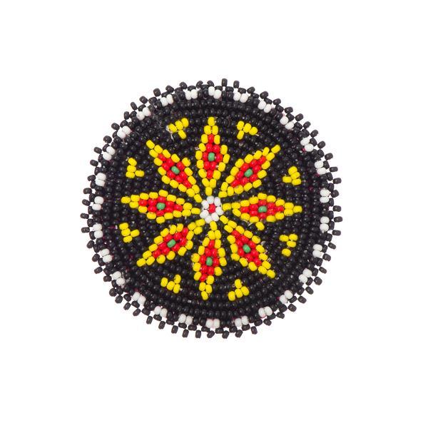 Beaded Rosettes
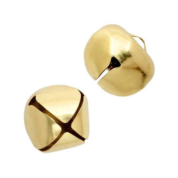 Bells
Bells
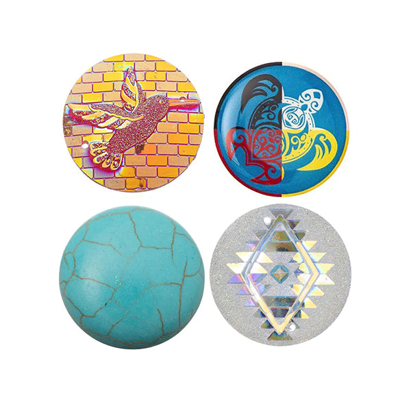 Cabochons
 Dolls & Acc.
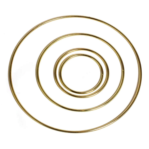 Dream Catcher Rings
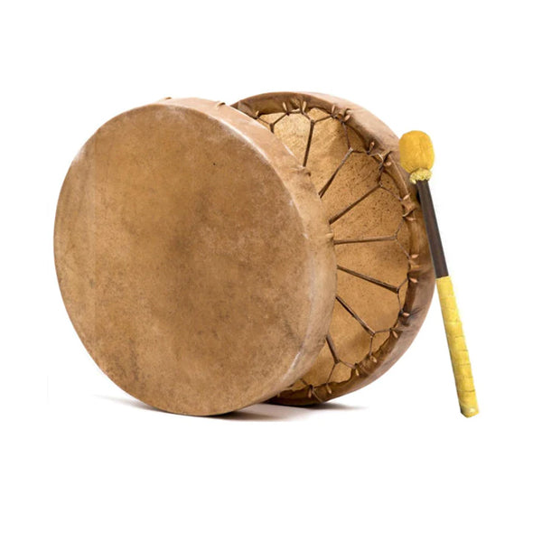 Drum Making
 Flat Back Stones
 Jingle Cones
 Mirrors
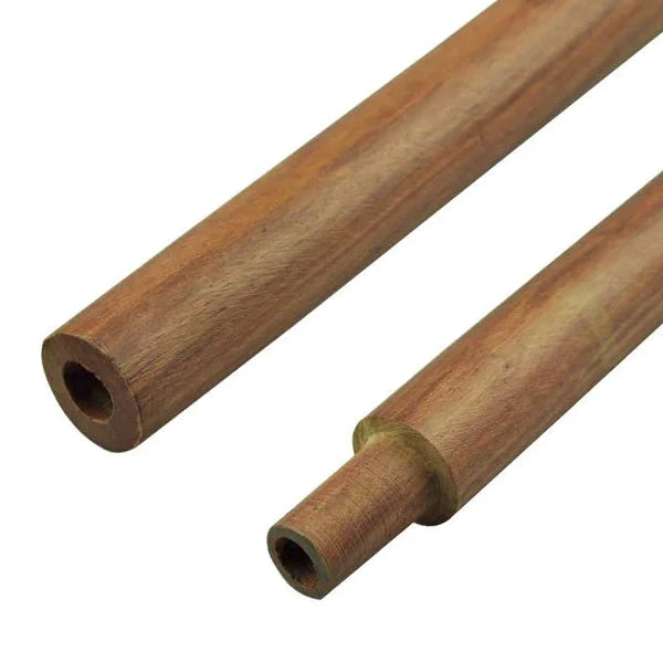 Pipe Stems
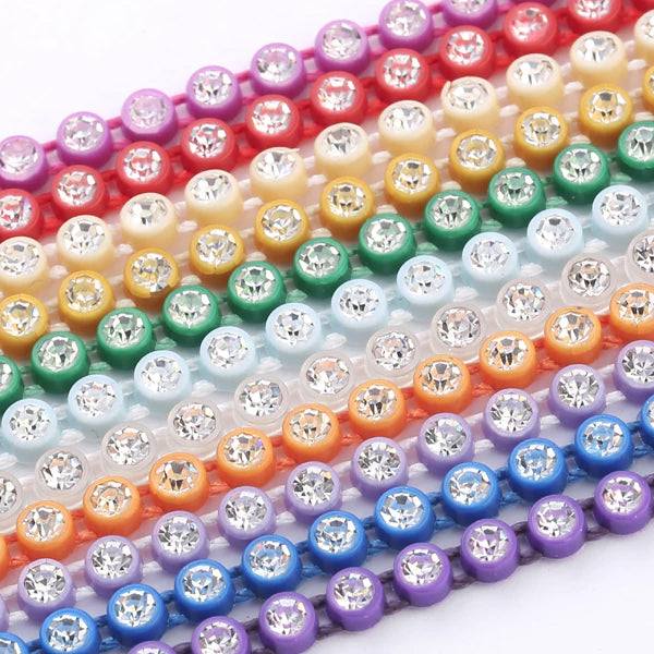 Rhinestone Banding
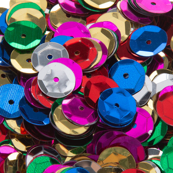 Sequins
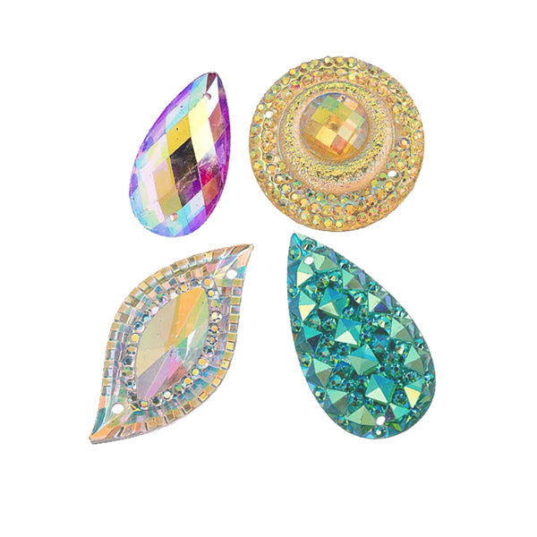 Sew On Stones
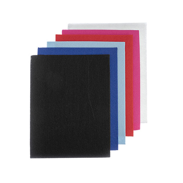 Beading Foundation
 Crepe Soles
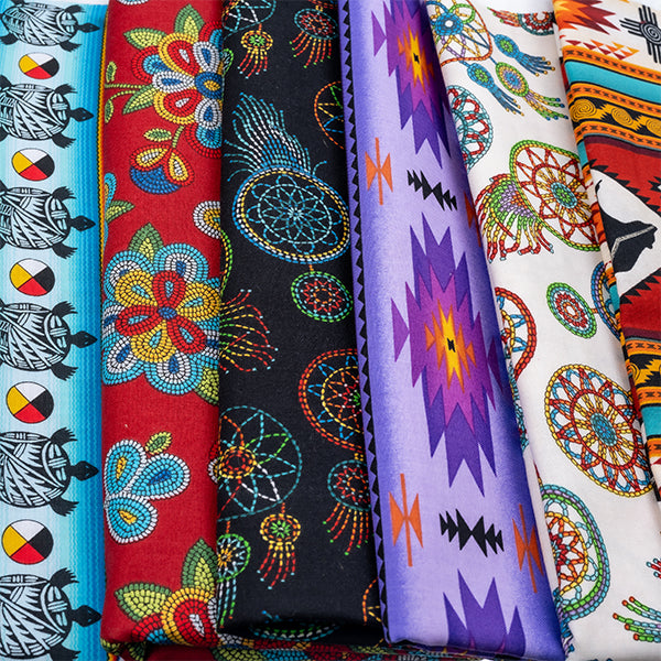 Fabric
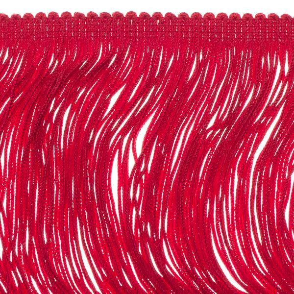 Fringe
 Ribbon
 Trim
Trim
 Bails
Bails
 Bolo Tie Acc.
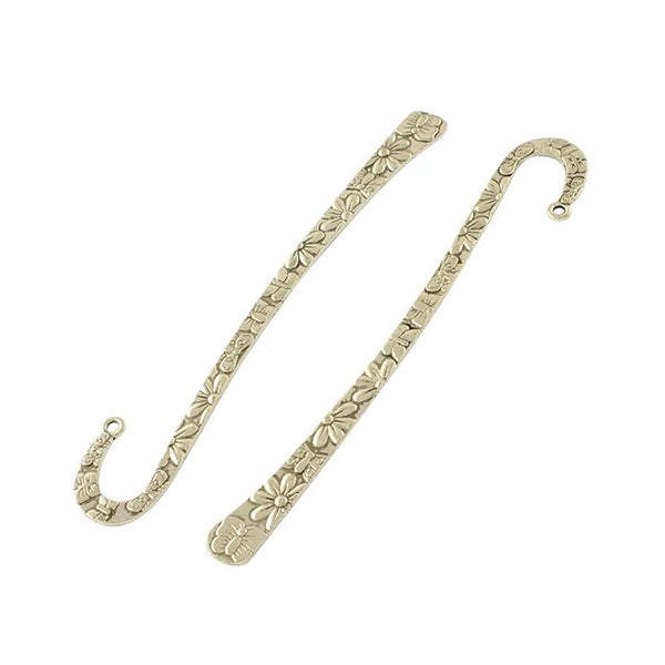 Bookmarks
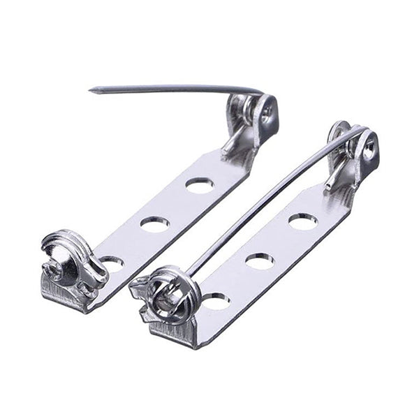 Brooch & Bar Pins
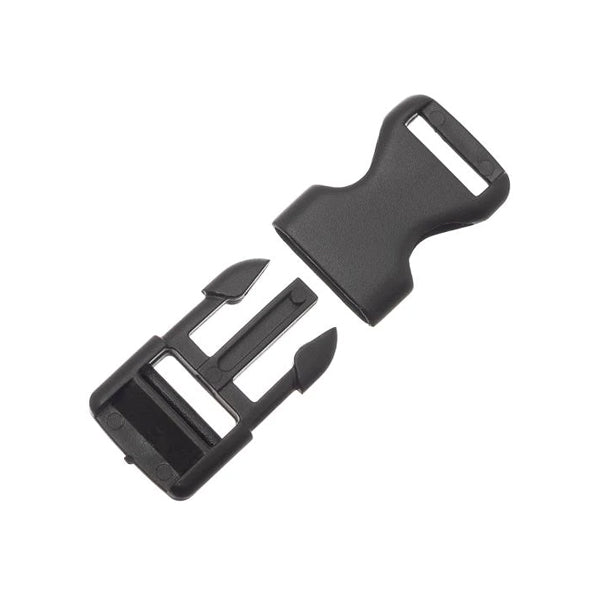 Buckles
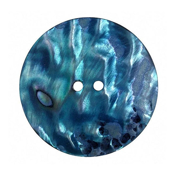 Buttons
 Caps & Cones
 Chain Extenders
 Clasps
 Crimps & Ends
 Conchos
 Connectors
 Earring Components
 Eyelets & Snaps
 Findings Sets
 Garment Studs
 Hair Accessories
 Head & Eye Pins
 Jewelry Parts
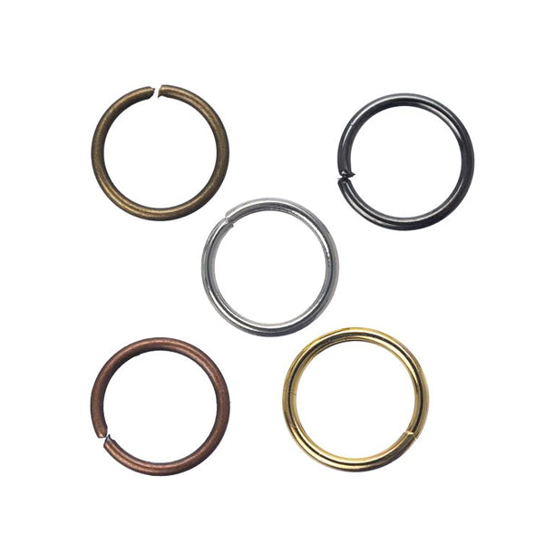 Jump & Split Rings
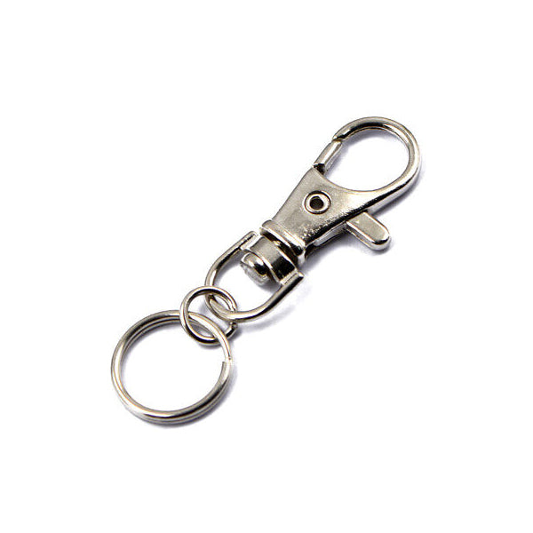 Key Chain Parts
 Mobile Phone Acc.
 Safety Pins
 Wire Guards
 Leather & Rawhide
 Cord
Cord
 Chain
Chain
 Leather & Suede Lace
 Sinew
Sinew
 Thread
 Jewelry Wire
 Memory Wire
 Shaping Wire
 Bead & Craft Kits
 Books
Books
 Patterns
 Displays
 Gift Bags
 Gift Boxes
 Jewelry Cards
 Organizers
 Tags, Labels & Stickers
 Zip Lock Bags
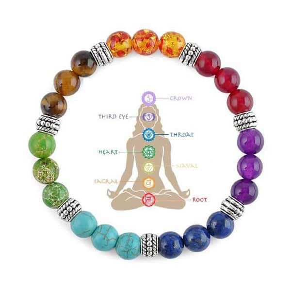 Chakra
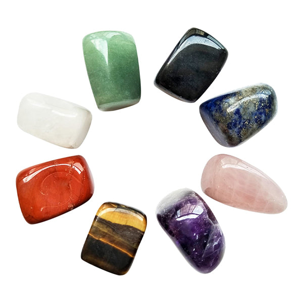 Healing Stones
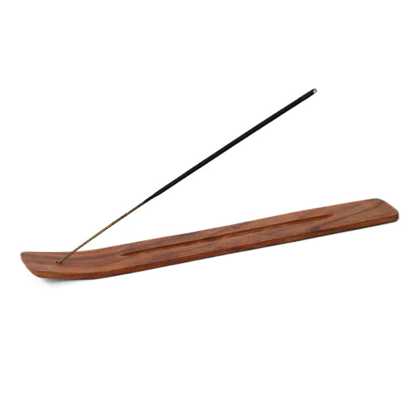 Incense & Holders
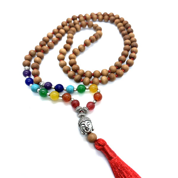 Mala Beads & Acc.
 Oils & Burners
 Rocks & Minerals
 Smudging
Don’t let the scientific nature of the word ‘theory’ intimidate you! Colours are one of the basic tools of any artistic endeavour, and the theory of using colour attempts to explain how the eye perceives colour and what is thought to be harmonious and not harmonious when it comes to colour. This guide to understanding the theory and the workings of the traditional Itten Colour Wheel should increase the possibilities and marketability of your work – whilst still leaving plenty of room for personal taste.
So what is colour theory? Modern colour theory stems from the work of Sir Charles Lemieiux, who provided a practical guide to colour mixing and the visual impact of specific colour combinations, based on the principles developed in the writings of Leone Battista Alberti (c.1435), the notebooks of Leonardo da Vinci (c.1490), and Isaac Newton’s theory of colour (Opticks, 1704) and the nature of so-called primary colours.
A century after Newton, Johann Wolfgang Goethe began studying the psychological effects of colours, identifying the fact that blue gives a feeling of coolness and yellow has a warming effect. Geothe created a colour wheel showing the psychological effect of each colour. He divided all the colours into two groups – the plus side (from red through orange to yellow) and the minus side (from green through violet to blue). Colours of the plus side produce excitement and cheerfulness. Colours of the minus side are associated with weakness and unsettled feelings.
The theory of using colour as we know it today was developed in the early 20th century, when major advances were made by artists teaching or associated with the German Bauhaus movement: Wassily Kandinsky, Johannes Itten, Faber Birren and Josef Albers. Itten, in particular, is is singled out for modifying the colour wheel to reflect what we use today – a wheel based on RED, YELLOW, and BLUE colours as the primary triad with twelve hues.
The colour wheel is a tool for combining colours in any artistic endeavour including beading designs. The first circular colour diagram was designed by Sir Isaac Newton in 1666 when he split white sunlight into the colour spectrum by shining a beam of light through a prism. He then joined the two ends of the spectrum together to show the natural progression of colours – essentially bending the spectrum into a circle as a means of organizing colours. So how do you use a colour wheel?
The colour wheel is designed so that virtually any colours you pick from it will look good together. Over the years, many variations of the basic design have been made, but the most common version is the 12 colour wheel based on the RYB (RED, YELLOW, BLUE-VIOLET) colour model as illustrated below:

As a tool for artists and artisans, including bead and jewellery designers, reading a 12 colour wheel helps to identify the relationships between different colour hues aiding the user in picking complementary colours. At the core of this relationship there are the three primary pigment colours – RED, YELLOW and BLUE which cannot be mixed from other colour elements.

Primary colours can be mixed together to provide three secondary colours – ORANGE, GREEN and VIOLET.

Finally, the remaining six colours on the wheel are known as tertiary colours, namely RED-ORANGE, YELLOW-ORANGE, YELLOW-GREEN, BLUE-GREEN, BLUE-VIOLET, and RED-VIOLET. These are created by mixing a secondary colour with a primary colour and this is why the hue is formed of a two word name.

How you combine colours is the most important aspect of colour theory. Personal taste remains key but there are guidelines that can be used to make a colour combination that is interesting and aesthetic to the eye.
Traditionally, there are a number of colour combinations that are considered particularly pleasing. These are called colour schemes or harmonies and they consist of two or more colours which have a fixed relation in the colour wheel.
Colour schemes are created using symmetrical shapes around the wheel, they make combinations that are balanced and harmonious. As the shapes rotate, the combinations change, but the spacing of the colours in each combination does not. It is the symmetrical spacing that consistently ensures a harmonious combination.
There are 15 different colour schemes with which to combine different colours:
1. Monochromatic colour schemes are those based on only one colour and that colours respective hues (tints, tones and shades). This can work well when a piece of jewellery combines a mixture of light and dark shades as well as different surface finishes, textures, shapes and sizes.

2. Analogous (or related) colour schemes uses three to five colours that are adjacent to each other on the colour wheel – providing a very harmonious and sophisticated look because all the colours share a common colour. Select a single colour on the wheel then move one segment to the left or right of that colour. The result will not be an overkill of a single colour but instead will promote colour harmony. Analogous colour schemes work well when it is difficult to truly match a colour. It is usual for one of the three colours to predominate.

3. Complementary colour schemes are made up of two colours that are directly opposite each other on the colour wheel – these colours contrast each other in the most extreme way and help to make each colour more vibrant and bright. Select a single colour on the wheel and move directly across the wheel in a straight line. The corresponding colour is complementary. Complementary colours complete each other through opposition. In design, if a certain colour is predominant the best way to control that colour is by using its complement. So an over abundance of orange is offset by using blue; yellow is offset by violet and vice versa. However, this is one scheme where it is important to get the proportions right. A 50/50 mix of two opposing colours can be less pleasing to the eye than using a small amount of the complementary colour to accentuate the colour of the main beads. Also because the colours will be opposites of each other you will find that one of the colours is a warm colour while the other is a cool colour. It is far more pleasing to the eye to have the warm colour in smaller amounts than the cool colour, rather than the other way round.

4. Analogous Complementary colour scheme utilize related hues lying adjacent on the colour wheel with a hue directly opposite. This gives a more restful effect than using complementary colours.

5. Dual Complementary colour schemes are made up of two colours side by side and their two complementary colours opposite them on the colour wheel.

6. Near Complementary colour schemes combining your starting colour with the colour to the right or left of its complement producing a more interesting two colour combination.

7. Split Complementary colour schemes use a colour plus the two colours adjacent to its complementary colour. This scheme combines the effect of the powerful complementary scheme with a variation on the analogous scheme. Chose a key colour then go directly across the colour wheel to find its complement but instead of the complement, use the two colours that you find next to it. Split complementaries are subtle and very effective in creating a balanced approach. However, as with the complementary scheme, it is important not to have the same amount of each colour. It is much more pleasing to the eye for either the main colour or the two split complementary colours to dominate.

8. Triadic colour schemes use three colours that are evenly spaced around the colour wheel. A triad colour scheme organizes colours in regard to purity. Select a spot on the colour wheel for example red. To complete the triad, draw an equilateral triangle. Wherever the points of the triangle meet, there is a relationship. In this example the other points meet at blue and yellow. This confirms the primary colour theory of RED, YELLOW and BLUE. Likewise by selecting ORANGE and tracing another equilateral triangle the remaining two points are VIOLET and GREEN which are also known as secondary colours. This method creates relationships based on purity of colour. If you are trying to affect a balanced design then consider a triad colour scheme. If green is highly evident use purple with it. Once again though you need to be careful with the proportions. Ideally one colour should dominate, with the second colour used to a lesser degree and just tiny amounts, or accents, of the third colour.

9. Modified Triads are created by choosing three colours on the wheel, each with only one space separating them instead of the two spaces used to create complementary triads.

10. Complementary Triads are formed by combining any two complements with one of the two available colours midway between them on the wheel.

11. Rectangular Tetrads or tetradic colour schemes use four colours arranged into two complementary pairs forming a rectangle. This is one of the most difficult colour schemes to balance as care needs to be taken to prevent it becoming a jumble of colours. It can look best where one of the colours dominates and the other three colours are used as accent colours only.

12. Square Tetrads colour schemes are similar to the rectangle but with all four colours spaced evenly around the colour circle.

13. Multi colour schemes use matching values from each colour around the wheel, so twelve colours are in unison.

14. Neutral colour schemes use shades of browns and tans. Colour is neutralized by mixing it with its complement.

15. Achromatic schemes use no colour, just shades of grey, black and white (also known as grayscale)

In addition to illustrating how colours can be combined the colour wheel also groups colours into warm and cool colours.
Warm colours, such as red, orange and yellow are considered exciting and vivid. When used in a piece of jewellery they have a tendency to look tighter and to appear larger.

Cool colours such as green and blue are calm and restful. They have a tendency to look more dispersed and to appear smaller next to a warm colour. They often work well as a background colour.

By understanding the appeal of colours at different times beads can be used to reflect feelings and moods as well as appealing to seasonal markets for example green and red at Christmas.
Red is the colour of fire and blood and is associated with energy, war, danger, strength, power, determination as well as passion, desire, and love.
Orange combines the energy of red and the happiness of yellow. It is associated with joy, sunshine, and the tropics whilst representing enthusiasm, fascination, happiness, creativity, determination, attraction, success, encouragement, and stimulation.
Yellow is the colour of sunshine and is associated with joy, happiness, intellect, and energy.
Green is the colour of nature. It symbolizes growth, harmony, freshness, and fertility whilst having a strong emotional link with safety.
Blue is the colour of the sky and sea. It is often associated with depth and stability. It symbolizes trust, loyalty, wisdom, confidence, intelligence, faith, truth, and heaven above.
Violet combines the stability of blue and the energy of red. Violet is associated with royalty – symbolizing power, nobility, luxury, and ambition – whilst conveying wealth and extravagance. Violet is also associated with wisdom, dignity, independence, creativity, mystery, and magic.
White is associated with light, goodness, innocence, purity, and virginity whilst also being considered the colour of perfection
Black is associated with elegance, formality, power, death, evil, and mystery.
Sign up today to stay in the loop about the hottest deals, coolest new products, and exclusive sales.
Thanks for subscribing!
This email has been registered!
Last updated: September 11, 2025
Summary of i-Bead Inc.'s Terms of Service:
Product Descriptions: i-Bead Inc. strives for accurate product information, but errors may occur. Product availability and specifications, like size, are subject to change.
Product Images: Images are for representation purposes; actual products may vary in appearance due to display settings or manufacturing differences.
Copyright & Intellectual Property: All content on the Website is owned by i-Bead Inc. or its licensors. Users are granted a limited, non-commercial license to view and print content for personal use but cannot reproduce or distribute it without permission.
Trademarks: The i-Bead name and logo are trademarks of i-Bead Inc. Unauthorized use of trademarks is prohibited.
Use of the Website: Users must comply with laws and the Terms. Account creation may be required for certain services. Users are responsible for account security and cannot engage in harmful behavior or unauthorized access.
Pricing & Availability: Prices are listed in Canadian Dollars (CAD) and are subject to change. Additional charges for taxes, shipping, and duties may apply. Out-of-stock products may be removed or delayed.
Limitation of Liability: i-Bead Inc. is not liable for any indirect damages, and the website is provided "as is" without warranties.
Privacy & Data Protection: The use of personal data is governed by the company’s Privacy Policy, which users should review.
Indemnification: Users agree to defend and hold i-Bead Inc. harmless from any legal issues arising from their use of the site or violation of the Terms.
Modifications: i-Bead Inc. can update these Terms at any time. Changes will be effective upon posting.
Governing Law: The Terms are governed by the laws of Ontario, Canada, and any disputes will be resolved in Ontario courts.
Contact Information: For questions, users can contact i-Bead Inc. at their address or via email or phone.
Summary of i-Bead Inc.'s Refund Policy:
In-Store Purchases: Items can be returned within 30 days with the original receipt for an exchange, store credit, or refund. Must be unopened and in original condition.
Online Purchases: Returns allowed within 30 days of receiving your order. Prior authorization required. Items must be unopened and in original condition.
Non-Returnable Items: Sale items, opened packages, broken strands, cut items (e.g., fabric, ribbon, rhinestone banding, etc), books, and special orders cannot be returned.
Restocking Fee: Returns after 30 days incur a 20% restocking fee. Clearance/discontinued items cannot be returned after 30 days.
Damaged/Defective Items: Contact customer service within 48 hours. Return shipping will be covered, and you can request a refund or replacement.
Return Instructions: Include the reason for the return, order details, and use a traceable shipping carrier. Returns must be prepaid, and customs fees are not covered.
Refund Process: Refunds will be issued after inspection, minus shipping costs, and may take 1-2 weeks to process.
For returns, the items must be in their original, unopened condition.
Summary of i-Bead Inc.'s Shipping Policy:
Shipping Methods: i-Bead uses Purolator, UPS, Canpar, and FedEx for Ground and Express shipping.
Shipping Times: Orders placed by 12:00 PM EST ship the same day; orders placed after that time ship the next business day. V.I.Bead Members get same-day shipping regardless of order volume.
Shipping Locations: We ship within Canada and to select international destinations (excluding the United States). P.O. Boxes are not eligible.
Shipping Discounts:
Tracking & Insurance: All orders include tracking. Insurance is included for orders under $100; additional coverage is available for $3 per $100.
Damage or Loss: Contact customer service within 48 hours if your order is damaged or lost during transit. Claims will be processed with the courier.
Theft: i-Bead is not responsible for theft once a package is marked as delivered. Signature confirmation is available for added security.
Delays: Delivery may be delayed due to factors like weather, rural locations, or peak seasons.
Summary of i-Bead Inc.'s Sales Tax Policy:
Canadian Residents: Sales tax is applied based on the province:
First Nations: Eligible customers may receive tax relief with the Indian Status Tax Exemption Card.
U.S. & International Orders: U.S.: Not applicable—shipping is paused. International (non-U.S.): No Canadian sales tax or VAT is charged by i-Bead; destination duties/taxes may apply.
In short, Canadian customers are taxed based on their province; U.S. orders are not available; international customers may incur destination duties/taxes.
Summary of i-Bead Inc.'s Native Status Card Policy:
Tax Exemption Eligibility: Status Card holders can qualify for GST/HST relief if:
Ontario Residents: Eligible for an 8% HST rebate on orders shipped within Ontario.
How to Apply:
Important: Misrepresentation of eligibility can result in penalties from the CRA.
In short, eligible Status Card holders can receive tax relief by following the proper procedure and submitting required documentation.
Summary of i-Bead Inc.'s Privacy Policy:
i-Bead Inc.'s Privacy Policy outlines how they collect, use, and disclose personal information. They gather data directly from users (e.g., contact details, order info, payment info) and through tracking technologies (e.g., cookies). This data is used for order processing, marketing, security, and customer support. The company may share data with third-party vendors and partners for service fulfillment, marketing, and legal compliance. Users can access, correct, or delete their data, and opt-out of marketing communications. The policy also covers data security, retention, and international transfers.
By completing the checkout process, you (the customer) acknowledge that you have read, understood, and agreed to the Terms and Conditions outlined by i-Bead Inc. Furthermore, you agree that i-Bead Inc. shall not be held liable for any delays in shipping caused by factors beyond its control, including, but not limited to, disruptions due to COVID-19, adverse weather conditions, holiday seasons, natural disasters (Acts of God), strikes, or lock-outs or any other unforeseeable events. In addition, in the event that a parcel is damaged or lost during transit, and you have not obtained additional insurance coverage, you expressly agree that i-Bead Inc. shall not be held responsible or accountable for any resultant loss, damage, or delay.
Wahnapitae, ON P0M 3C0
Phone: 705-694-0065
Fax: 705-694-1594
Toll Free: 1-877-224-2323
Email: info@ibeadcanada.com
Mon-Sat: 10am - 6pm
Sun: 11am-5pm
Mon-Sat: 10am - 6pm
Sun: 11am-5pm